



#125 peterPAN
70x140
Acrylic on canvas
05.2024
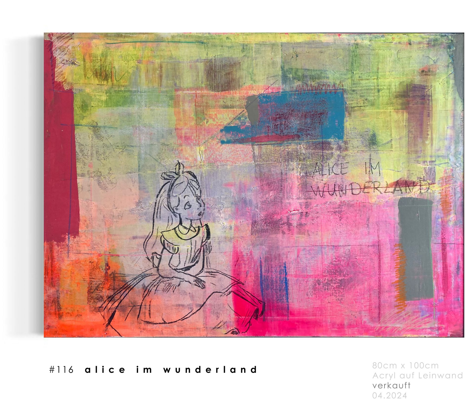
#121alice in wonderland
PopUpART vol 2! My next attempt with a tried and tested motif. This picture is in 60x50 format and fills the room. A real eye-catcher! Very colorful but still subtle. In this picture, Wonderland is crossed out again.
Why this is so is in the eye of the beholder. Alice and her lettering were drawn onto the glue board using a charcoal pencil.
Chalk and pastel colors complete the overall work and give it a distinctive character.
05.2024 / 60x50 / Acrylic, charcoal and chalk on canvas
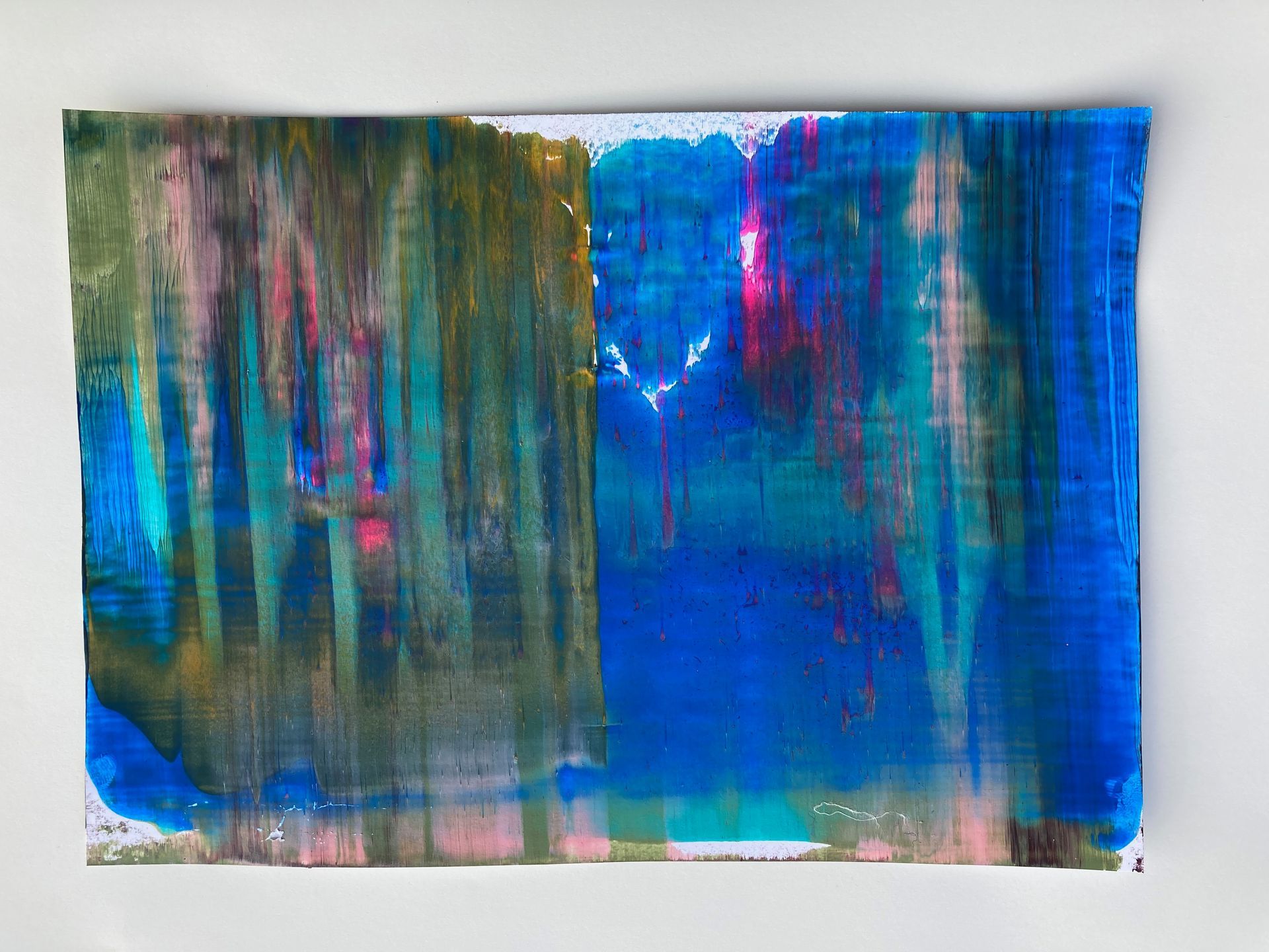
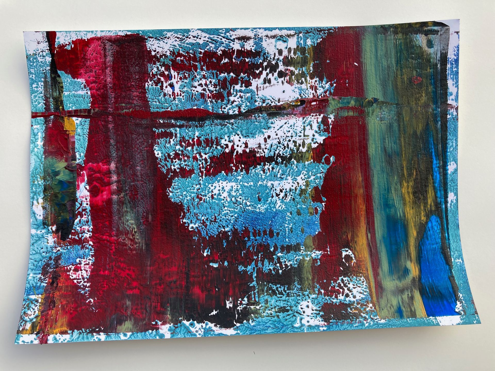
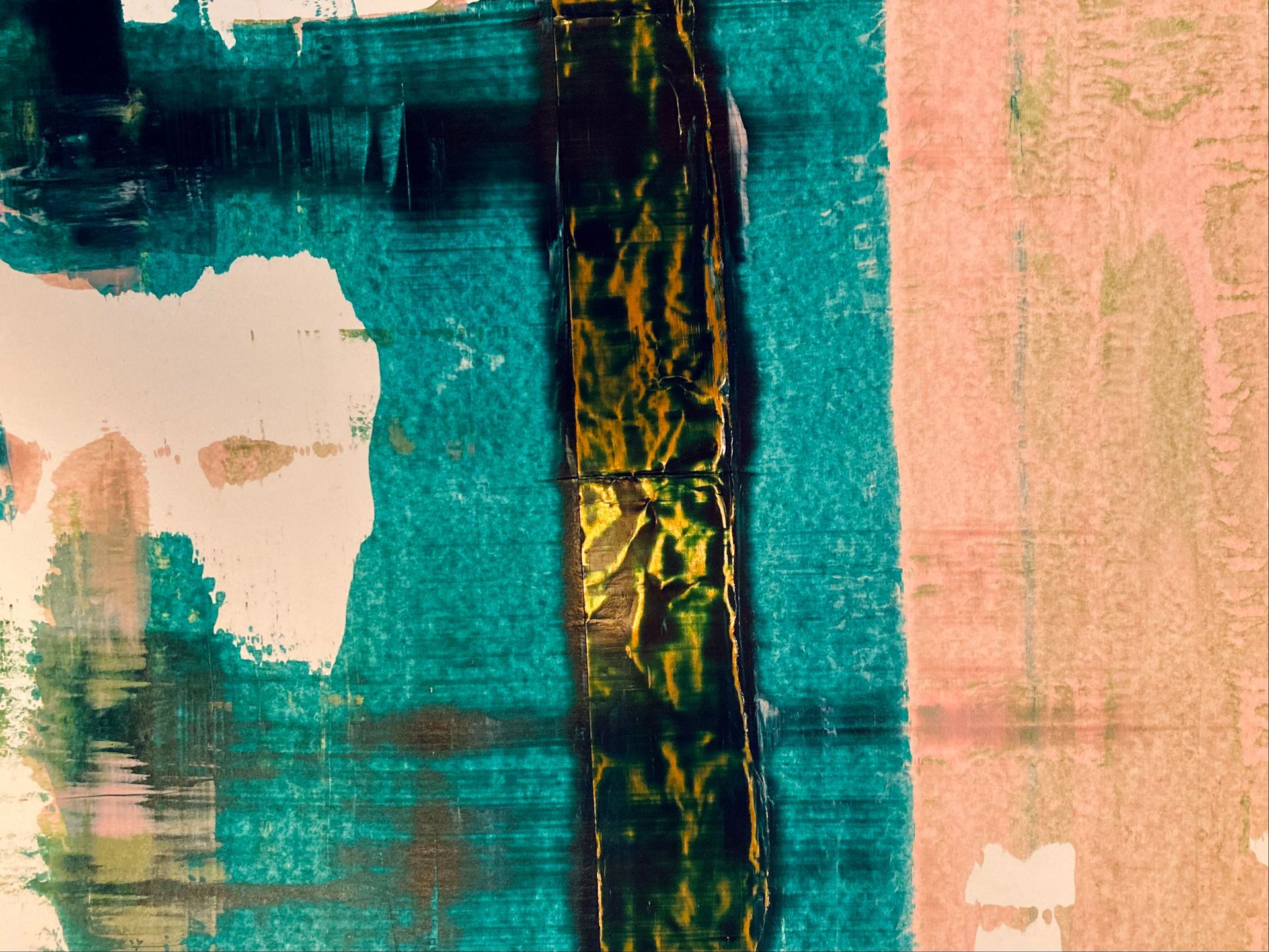
#120interference
This series has been waiting to be published for a long time. In addition to my larger works, I have recently also been working on small formats. These are perfect for trying out new techniques and preparing for new, larger formats. These pictures all have a format of 21x29. The simplicity and clarity in the pictures is not only visible, but the unwanted depth makes you linger...
#117
expectation
Some pictures are created simply with a clear idea in mind. That was the case with this work. This abstract picture was created in the studio at the end of March on a 40x60 Kapa plate. This picture also leaves a lot of room for interpretation. I chose the title deliberately here, as my expectations of the final picture were fulfilled this time. In some processes of previous pictures, this deviates after the first few moments...
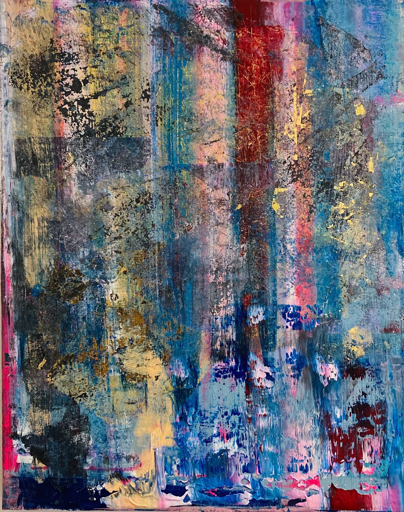
#114omit
This work triggers emotions not only at first glance. Calm sinks into unrest and shapes take fixed places. Playfulness meets maturity and every color is in the right place.
In this picture, structures blur into one another and create new ones. This work was created in March 2024 and stretched on canvas on an area of 80x100, it enlivens every room and makes it feel like it is in the right place.
Using various techniques, an expression was created that reflects my current feelings in my own artistic development.
#113color
ColourIn painting, it refers to the selection, harmony, shading and composition of the different colors in a painting.
This very abstract work contains many colors that seem restless at first glance. However, when you look at it for a longer period of time, your gaze becomes calmer and the excitement gives way to a warmth in which the interplay of colors triggers emotions at best.
Multiple layers of paint, a variety of styles and an unusual approach make this picture unique. Acrylic paint, charcoal pencil and a fineliner form the basis for this picture.
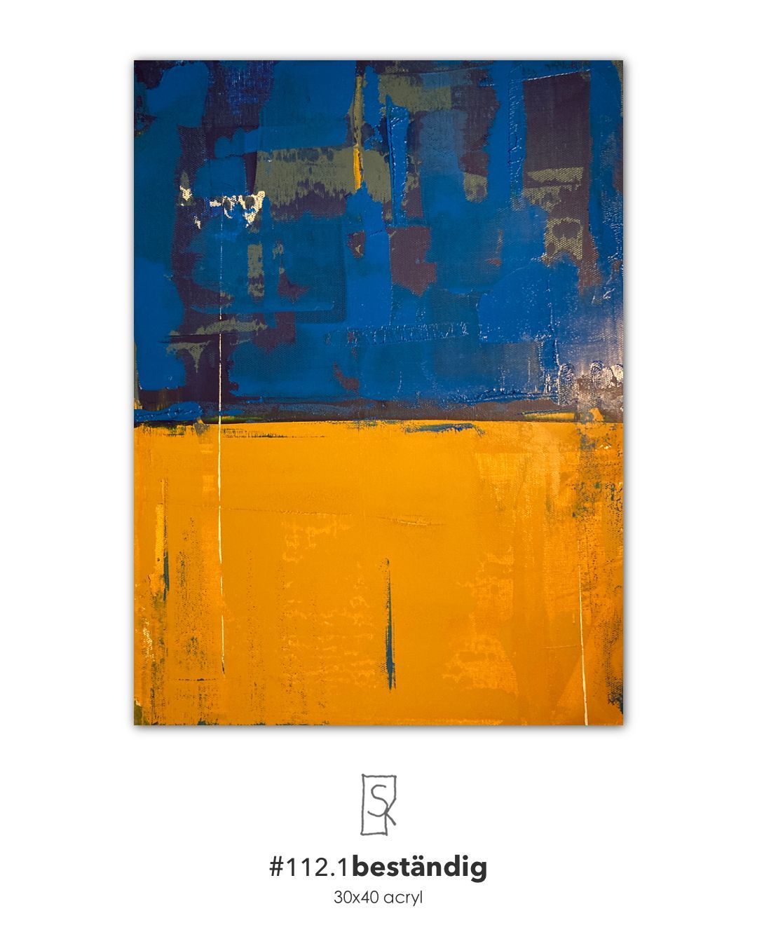
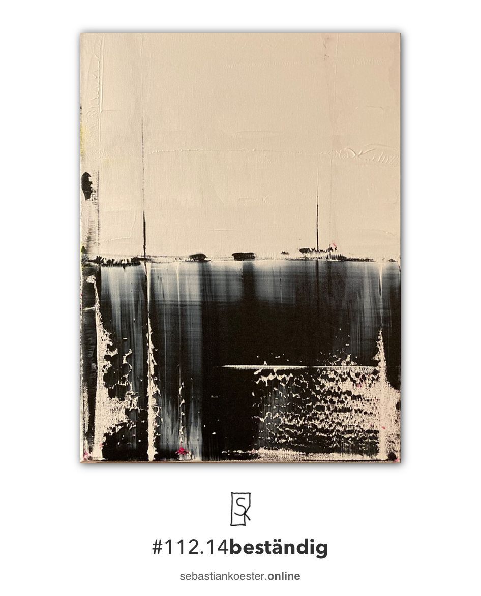
#112resistantseries
It has been my wish for a long time to make such a series. In the simplicity I created a beauty , which is also in the eye of the beholder. By applying different Color layers every single picture gets that special Power . Acrylic and oil combine in some paintings and give these structure and shine. Through the desired division and the play of colors I found my new Luck .
#109cold
30x40 acryl / 01.2024
New approach, new technology, new colors...
Despite its simplicity, this image is diverse.
Despite its size, it is present.
This picture is part of my artistic process that I am currently in. Simple beauty is created through simple steps. For me, the freedom to choose these steps myself is a way of arriving at something new.
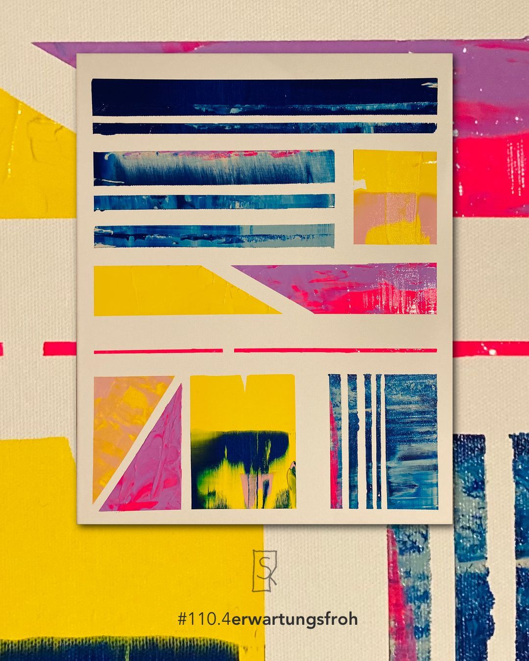
#110expectantseries
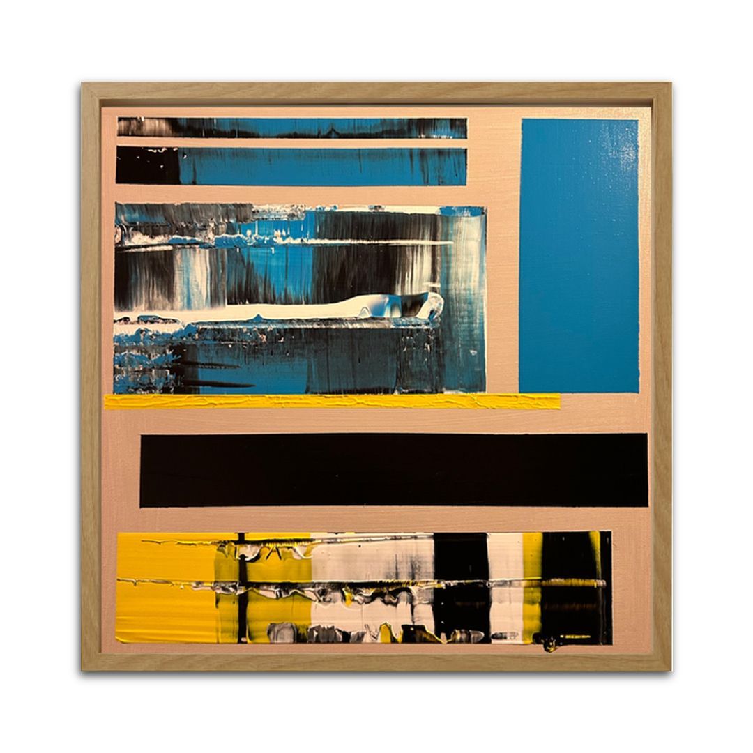
My interpretation of Bauhaus in connection with abstract art. Clear shapes, different color combinations and all of this as a series in the same FORMAT. These pictures reflect a process that I am currently in. Going new ways, deepening learned techniques and reducing tried and tested ones. These pictures radiate calm and tidiness, which I also felt while creating them. Colorful and yet still appearing simple.
#108iron
In This picture shows my connection with the 1. FC Union Berlin. I have wanted to create a picture in this style for a long time and in the color study #107 I came up with this simple but also beautiful and elegant idea to use several layers of color to paint the colors of my club on a canvas.
Versatile and different, just like the FCUAcrylic paints are overlaid with oil paints, but still give each other enough space. Expressive, yet simple.
30x40 / acrylic & oil / on canvas / 01.2024
#105wandeln
"I walk blooming through the gardens of your silent solitude."
This nice quote was the foundation for my latest work. Expressing words in colors and finding oneself in them became Mission statementThe basis for this was an older picture that I had wanted to paint over for a long time.
On
140x124
cm, new emotions and room for interpretation are now found. The old ideas still shine through ever so slightly, giving the picture a real
beautiful depth
Clear shapes replace abstract ones and the interplay of the few colors harmonizes not only at first glance!
A crowd of people crosses a wet street and a person dressed in red is
silent observer
. What do you see?
#104two-tone13.10.23
15 new pictureswere created and the series is named #Twotone. Acrylic in A4 format. This series looks fresh and Timeless.
Each image stands on its own and leaves room for interpretation. Some are simple, others graceful and playful.
Here only
a little insight
in the latest works. More to come soon...
#102harmony07.09.23
This series, consisting of 24 individual images in A3 & A4 and is named harmony. I experimented with many colors and so each individual work received its own touch. Colorful & simple, each one is nevertheless in harmony with the others. Different techniques and color combinations make this series something special and I am very happy to be able to present it here. Each individual carries his emotions and his own story.
#102harmony
series
#100emportauchen23.08.23
40x50 / 08.2023
This is my hundredth painting and it is called #100emportive. For the festive occasion in the picture fine Gold leaf The golden shimmer, which keeps seeking the light, gives the picture a festive touch. It harmonizes with the three basic colors (white, black and neon pink) and blends seamlessly into the overall picture.
The deliberate restlessness runs through the whole picture and lets the viewing eyes see many color changes
ufs, which, when viewed individually, radiate calm. The gold leaf in the lower part has been applied to the fresh paint. This also causes unevenness in the picture.
#98go together4.7.23
INot only are the shapes and colors in the work itself in harmony, but this picture convinces with its simplicity in harmony. #GettingTogether is my latest work, which I am very proud of, because after many colorful pictures I have finally managed to find a little peace in the picture. The transition from clear shapes to the abstract fits together perfectly here. This picture invites you to linger...
70cmx100cm / Acrylic
#97beforevision27.06.23
DThis picture is number 97 in my list of works and impresses with its colors and itsr Clarity despite the deliberate unrest in the picture itself. The silver stripe in the middle of the picture gives it depth and radiance. In this work, providence stands for the individual events that happen to a person. Each of us is a blank canvas that is painted with color (events) over the course of our lives. What emerges from this and what colors are added is providence...
#sequences in A3 and A4 12.6.23
II am currently working on a series of smaller formats to try out new techniques, test color combinations and to develop myself further. All of this works great in A3 and A4, as the images are much smaller than usual and I can implement ideas more quickly and precisely. I did not have this freedom with large works and feel very comfortable in this new terrain. Working more minimalistically with the same result. Many new works have already been created. You can find more of them in the catalog of works...
#87beginning26.05.23
MA new painting is finished and it is called "anbeginn". The name stands for the departure to new shores in terms of art. I would like to try new things, be simpler and learn new techniques. This painting should be the starting signal for something new for me.
The simplicity in the colors and the interplay of a few elements form the foundation for this work, which stands for itself.
#80unison
UThis was created over Easter series, consisting of 6 individual framed pictures (almost all in 21x29.5). New technique, new luck! This time I tried, rather indirectly, the printing process. Which I other techniques mixed and created 6 unique images which impress with their clarity.
unison
stands in Latin for
monotonous or monotonous
. I have consciously chosen this name even though each picture is different. Each one tells its own story but
together they are somehow one
.
#72regatta
II have long wanted to paint a regatta, I don't know why. Maybe it's the sea, the beautiful boats or the mighty waves. In this picture, which is in abstract realism I have already used mastered techniques and have continued to try out new ones. The result is a colorful Image ( 59,4 × 84,1 ) which by its intentional simplicity captivates.
Created:
21.02.23
#71 hopeful / 19.02.2023
DThis work captivates with its colours and invites
to dream. Despite the deliberate unrest in the
Colors also seem to have a certain order
to have found it. At first glance,
immediately a feeling of familiarity spreads that in the
second glance only deepens it further.
This expressive image immediately enlivens the room
and you sink into it full of hope.
The positive effect it produces in you lasts
the more often you look at it.
Size: 80x86 Color: Acrylic
Created: 8.2.23 Image number:#71
#69beach tag
#69beach tag
DThis is my latest work, #69beach day is the name of the game and on an area of 45x135 Not only the colors mix.
Das Interaction of yellow, blue and white tones harmonises particularly well here and gives the picture liveliness. Here too, Acrylic and spatulas worked.
#61nepal
This work was created on 11.12.2022 and bears the name Nepal. A photo was used as a template. The image has a size of 85x114 and, like many other pictures, is mounted on a self-stretched frame.
You can lose yourself in this picture and let its colors take effect. The mountains in the background and the colorful prayer flags in the foreground. This colorful warm play of the prayer flags harmonizes with the cold mountains.
#60light&rain

9.12.2022


